
 ultimate-guide
How to Choose Timeless Statement Wall Art
Table of Contents
- Why Most Statement Art Dates Itself (and How to Avoid That)
- How to Choose Wall Art Size: The 60-70% Rule
- Interior Design Art Placement Rules: Eye Level and Focal Points
- Color Palettes That Stay Elegant for Decades
- Framing Materials and Finish That Signal Quality
- Balancing a Statement Piece With Your Existing Decor
- Protecting Your Investment: Maintenance and Preservation
- Start With a Piece You'll Love for Years
- Frequently Asked Questions
Last Updated: September 9, 2026
Why Most Statement Art Dates Itself (and How to Avoid That)
The most common mistake in choosing timeless statement wall art is prioritizing trend over proportion and palette. A piece that shouts "2024" through neon gradients or ultra-thin gold geometric lines will feel dated before the paint dries. Statement wall art is the visual anchor of a room, so the goal is selecting a work that holds its aesthetic weight for a decade, not a single season.
Timelessness is not about playing it safe, but about choosing art that speaks to enduring principles of design rather than fleeting fads. This guide will walk you through sizing, placement, palette, and framing so your investment feels as relevant in ten years as it does today.
A common approach that fails is buying a piece to match a temporary decor trend, like a specific Pantone color of the year. Instead, focus on the emotional response and how the artwork interacts with your spatial awareness. The best statement pieces feel inevitable, as if the wall was waiting for them.
How to Choose Wall Art Size: The 60-70% Rule
The single most reliable formula for sizing is the 60-70% rule. This interior design guideline states that your wall art should cover roughly 60 to 70 percent of the available wall space above a piece of furniture to achieve proper proportion and balance.
To apply this, measure the width of your sofa, console, or bed frame. Multiply that number by 0.6 and 0.7 to find the ideal width range for your artwork. For example, a 96-inch sofa calls for a canvas between 58 and 67 inches wide, which is why oversized wall art often works better than smaller, isolated pieces.
- Measure the furniture width: This is your starting baseline.
- Calculate the range: Multiply by 0.6 and 0.7 for the target art width.
- Consider the height: For a standard 9-foot ceiling, a 31 to 40 inch tall canvas feels substantial without overwhelming the room.
This is where many homeowners stumble. They fall in love with a piece online without checking the tape measure, and it arrives looking like a postage stamp on a large wall. The 60-70% rule prevents this by forcing you to consider the relationship between the art and its surroundings.
Interior Design Art Placement Rules: Eye Level and Focal Points
Once the size is correct, placement determines whether the room feels curated or chaotic. The golden rule for hanging is to position the center of the artwork at eye level, typically 57 to 60 inches from the floor, which aligns with the standard gallery wall height used in museums. However, this baseline needs adjustment based on the specific furniture and room configuration.
The Formula for Hanging Above Furniture
The 57-60 inch rule assumes a blank wall. When hanging above a sofa, console, or bed, the relationship to the furniture below matters more than the absolute height from the floor. The standard formula is:
- Measure the height of your furniture. For example, a standard sofa seat is around 18 inches, but the back height is typically 30 to 36 inches.
- Add 6 to 8 inches of clearance between the top of the furniture and the bottom of the frame. This gap creates visual breathing room and prevents the art from feeling cramped.
- The result is the bottom edge of your frame. For a sofa with a 34-inch back, the bottom of the art should sit at 40 to 42 inches from the floor.
This method ensures the art feels anchored to the furniture, not floating in space. For a 96-inch sofa with a 34-inch back, a 40-inch tall canvas will have its center at 60 to 62 inches, which is slightly above the standard eye level but correct for the context.
Adjusting for Ceiling Height and Wall Width
Standard 8-foot ceilings require a different approach than 10-foot ceilings. In a room with 10-foot ceilings, the 57-60 inch rule still applies for the center of the art, but the piece must be larger to fill the vertical space. A common pattern is to increase the art height by 10-15% for every additional foot of ceiling height beyond 8 feet.
Wall width also dictates placement. If you are hanging a single statement piece on a wall that is 120 inches wide, the art should be centered, but the visual weight should also consider adjacent architectural features. If the wall has a window on one side, shift the art slightly toward the center of the remaining solid wall to balance the asymmetry.
Lighting as a Placement Variable
Placement is not just about height; it is about how light interacts with the piece. Track lighting or a picture light should be aimed at a 30-degree angle toward the center of the canvas to reduce glare. If you rely on natural light, observe how shadows fall across the wall at different times of day. A piece placed directly opposite a west-facing window will receive harsh afternoon light, which can cause glare and fading. Positioning the art on a perpendicular wall often provides more stable, diffused light.
The Focal Point Hierarchy
In a living room, the primary focal point is usually the fireplace or the main seating wall. Your statement piece should anchor this zone, drawing the eye naturally without competing with architectural features like crown molding or large windows. If you have a fireplace with a substantial mantel, the art should be centered above it, but the width should not exceed the mantel width by more than 10-15%. If the mantel is 60 inches wide, your art should be between 54 and 66 inches wide, with the center aligned perfectly with the fireplace opening.
For rooms with multiple seating areas, prioritize the wall that is visible from the primary entry point. This creates a natural sightline that guides visitors into the space. The secondary walls can hold smaller pieces or gallery arrangements, but they should never compete with the main statement piece for visual attention.
Color Palettes That Stay Elegant for Decades
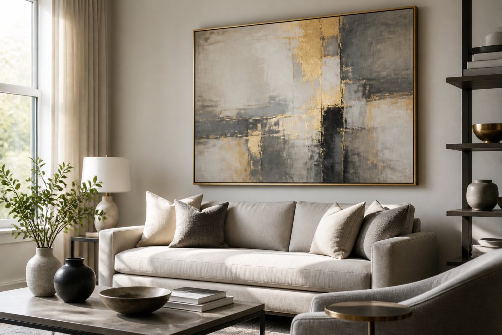
Choosing a color palette for longevity is about favoring hues that have proven their staying power in fine art prints and contemporary artwork. Neutral tones, such as greys, warm whites, and soft beiges, paired with a single accent color like deep blue or muted gold, offer a sophistication that resists the passage of time. But the palette is not just about aesthetics, it is about the psychological and physiological impact of living with a large-scale piece every day.
The Psychology of Color in Oversized Art
Most guides stop at "blue is calming." The reality is more nuanced. When a canvas covers 60-70% of a wall, it becomes part of the room's environmental psychology. Color psychology research consistently shows that large fields of color have a measurably different impact than small accents. A deep blue canvas, for example, can lower heart rate and promote focus, making it ideal for a home office or reading nook. However, the same blue in a dining room may feel cold and suppress appetite. The context of the room matters as much as the color itself.
Warm earth tones, terracotta, ochre, and muted olive, are often cited in environmental psychology studies as promoting feelings of security and groundedness. These colors have been present in human dwellings for millennia, from cave paintings to classical frescoes, which is why they rarely feel dated. In contrast, high-chroma synthetic colors like electric purple or neon green are a relatively recent invention in human history, and they carry a "temporal signature" that makes them feel tied to specific decades.
Color and Spatial Perception
Color also alters how you perceive the physical dimensions of a room. Dark, saturated colors on a large canvas can make a wall feel closer, creating a cozy, intimate atmosphere in a large, cavernous room. Conversely, light, airy colors on a large canvas can make a small room feel more expansive. This is a functional consideration: a 60-inch wide canvas in deep forest green will visually shrink a 12-foot wall, which may be desirable in a large open-plan living area but overwhelming in a compact den.
A practical approach is to consider the room's natural light and orientation. North-facing rooms receive cool, diffuse light, so a palette with warm undertones, greige, soft gold, or warm terracotta, will counteract the chill. South-facing rooms are bathed in warm light, so cooler tones like slate blue or sage green will balance the warmth without feeling stark.
The Case for Muted Complexity
The most timeless palettes are rarely flat. They feature muted complexity, colors that are not fully saturated but have depth and variation. A large abstract canvas in a single hue, like a deep indigo, can feel flat if it lacks tonal variation. The best pieces have subtle shifts in value, texture, or sheen that reward prolonged viewing. This is why many collectors prefer hand-finished canvases or giclée prints on textured substrates over flat digital prints; the surface variation adds a layer of visual interest that keeps the piece engaging over years.
Avoiding Era-Locked Palettes
For a truly timeless look, avoid palettes tied to specific eras, such as the millennial pink craze or the stark black-and-white minimalism that dominated the early 2010s. Instead, look at the color palette used in classical interiors: deep navies, forest greens, and warm greige tones. These colors act as a backdrop for your life, not a statement about the current year. The key is to choose colors that have a long history of use in interior spaces, colors that were popular in the 18th century and remain relevant today. This historical continuity is the strongest predictor of future timelessness.
Framing Materials and Finish That Signal Quality
The frame is not an afterthought; it is the jewelry that completes the outfit. Framing materials like natural oak frames or sleek black metal profiles signal quality and craft, whereas cheap plastic molding can undermine even the most beautiful canvas. The finish should complement the artwork without distracting from it.
A floating frame, where the canvas appears to hover inside the frame, offers a modern look that works well with abstract art. For a more traditional aesthetic, a solid wood frame with a subtle profile adds warmth and texture. The key is to avoid ornate, overly glossy finishes that can look dated quickly.
- Natural Oak: Adds warmth, works well with modern bohemian and Scandinavian styles.
- Matte Black: Provides a crisp, contemporary edge that frames the art without competing.
- Brass/Gold Accents: Introduces a touch of refined luxury, best used sparingly.
When you invest in a framed canvas, the quality of the materials also affects the archival quality of the piece. A sturdy frame protects the canvas from warping and environmental damage, ensuring that your statement wall art remains a centerpiece for years. This is where the difference between a fast-fashion decor item and a lasting investment becomes clear.
Balancing a Statement Piece With Your Existing Decor
The fear of commitment is real, but a statement piece should not match everything in the room; it should elevate it. Balancing visual weight means allowing the artwork to be the hero while the surrounding decor plays a supporting role. This is the essence of interior styling and curation.
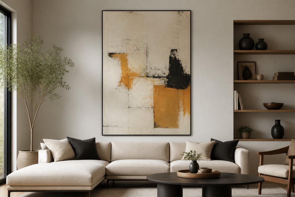
If your room features bold patterns in the upholstery, choose a canvas with a more subdued palette to avoid a clash. Conversely, if your furniture is mostly neutral, a piece with a pop of color, like an orange and black abstract canvas, can inject energy without overwhelming the space. The goal is a conversation between the art and the furniture.
A practical method is to pull a secondary color from the artwork and echo it in your throw pillows, area rugs, or decorative objects. This creates a sense of cohesion without making the room feel overly matched. The aesthetic preference here is for harmony over uniformity.
Protecting Your Investment: Maintenance and Preservation
Art is an asset, and protecting your investment requires basic maintenance. Direct sunlight is the enemy of all art, causing colors to fade and canvas fibers to weaken. Position your piece away from harsh UV rays, or use window treatments that filter light to preserve the artistic integrity of the work.
Dust accumulation is another silent killer. Clean the frame and the surface of the canvas gently with a soft, dry microfiber cloth every few weeks. Avoid using water or cleaning chemicals on the canvas, as these can cause staining or damage to the paint layer.
For resale value and investment potential, keeping the artwork in pristine condition is crucial. A canvas with no fading, scratches, or dents retains its value far better than one that has been neglected. If you are considering a future home refresh, the artwork can move with you, adapting to new spaces if it has been well cared for.
Start With a Piece You'll Love for Years
Ultimately, the best strategy for choosing timeless statement wall art is to trust your own aesthetic preference over the latest trend. If a piece makes you feel something every time you walk into the room, that emotional connection will outlast any passing fad.
Eleviq9 curates a selection of large-scale canvases designed with this longevity in mind, from the calming depth of an extra large blue abstract canvas to the refined contrast of grey and gold. These pieces are crafted to serve as the focal point of your living room, bedroom, or office, blending modern bohemian aesthetics with the quality of fine art prints.

Start with a piece that speaks to your personal style, and build the room around that inspiration. This approach ensures that your home feels cohesive and sophisticated, not just for the current season, but for the many years you will live with it.
Frequently Asked Questions
What is the 2/3 rule for wall art?
The 2/3 rule is a sizing guideline stating that the width of your wall art should be roughly two-thirds the width of the furniture below it, such as a sofa or bed. A 90-inch sofa calls for art around 60 inches wide. This proportion creates visual balance without overwhelming the room. For larger walls, this rule ensures the piece feels intentional and grounded, not floating or undersized.
What is the 70/30 rule in interior design art placement?
The 70/30 rule in art placement refers to the proportion of your wall's surface area that should be covered. A statement piece should cover about 60-70% of the available wall space, leaving 30-40% as empty breathing room. This ratio prevents the art from overwhelming the space while still giving it enough presence to act as a true focal point. It applies to the combined width of multiple pieces in a gallery wall too.
How do you choose statement art that remains timeless rather than trendy?
Focus on three factors: a restrained color palette, abstract or classic subject matter, and high-quality materials. Neutral tones like grey, blue, or earth pigments with a single accent color tend to outlast bold trend-driven hues. Abstract compositions or fine art prints of nature scenes avoid the dated look of specific stylistic movements. Finally, choose a canvas with archival quality prints and a solid wood frame.
Should wall art match the furniture or the room's color palette?
Wall art should complement the room's overall color palette rather than strictly match individual furniture pieces. Pick art that pulls one or two accent colors from your existing textiles and walls, then adds a subtle contrast. For example, a grey and gold abstract canvas works beautifully with both cool grey sofas and warm neutral tones. This approach creates cohesion without making the space feel overly matched or monotonous.
What is the best height to hang large statement wall art?
The center of the artwork should sit at eye level, approximately 57-60 inches from the floor. This standard works across most rooms and ceiling heights. When hanging above a sofa or console, keep the bottom edge 6-12 inches above the furniture's back. For oversized pieces like a 70-inch canvas, the eye-level rule ensures the art is appreciated without straining the neck, creating a gallery-like experience at home.
What materials and frames signify high-quality, timeless art?
Look for gallery-wrapped canvas with archival-quality, fade-resistant inks, and solid wood frames with a natural oak or matte black finish. These materials resist warping and discoloration for decades. Avoid plastic frames and glossy poster prints, which degrade quickly and appear mass-produced. A well-constructed piece, such as a 24x48 framed canvas, maintains its structural integrity and visual appeal far longer than a cheap alternative.
Choosing statement wall art is a balance of proportion, palette, and personal resonance. By applying the sizing rules and placement guidelines above, you can avoid the pitfalls of fast decor and create a space that feels both current and enduring. Explore the collection at Eleviq9 to find a canvas that elevates your living space and reflects your unique sense of style, and add to cart the piece that feels like home.