
 listicle
Best Statement Wall Art for Living Room: 2026 Guide
Table of Contents
- Why Statement Wall Art Transforms a Living Room
- Quick Comparison: Top Statement Wall Art Picks
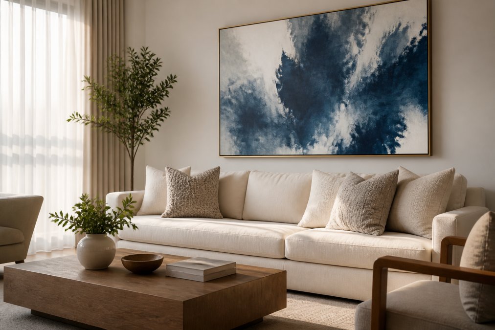
- Best Oversized Wall Art for Living Room: Extra Large Blue Abstract
- Best for Bold Drama: Orange & Black Abstract Canvas
- Best for Neutral Luxury: Grey & Gold Abstract Canvas
- Best for Nature-Inspired Calm: Romantic Tree Landscape
- How to Arrange Wall Art in Living Room: Sizing Rules
- How to Choose Statement Wall Art by Color and Mood
- Frequently Asked Questions
Last Updated: September 6, 2026
The right statement wall art anchors your living room layout, sets the emotional tone, and reveals your personal style. This guide covers sizing rules and color psychology so you can choose with confidence.

Most people hang art that is too small. Your art should occupy roughly two-thirds to three-quarters of the width of the sofa or console beneath it. Below are top curated picks, the exact hanging height, and how to match a piece's palette to your desired mood.
Why Statement Wall Art Transforms a Living Room
Statement wall art is the fastest way to change how a room feels without renovating. A large, well-chosen canvas creates an instant focal point, adds depth, and communicates your aesthetic. The psychology of color plays a significant role: cool tones like blue and green encourage calm; warm tones like orange and red add energy and stimulate conversation.

Quick Comparison: Top Statement Wall Art Picks
| Artwork | Size (inches) | Best For | Price |
|---|---|---|---|
| Extra Large Blue Abstract | 70 x 31 | Oversized walls above sectionals | $371.32 |
| Orange & Black Abstract | 70 x 31 | Bold drama and high contrast | $371.32 |
| Grey & Gold Abstract | 24 x 48 | Neutral luxury with warm accents | $111.64 |
| Romantic Tree Landscape | 30 x 60 | Nature-inspired calm and softness | $184.63 |
| Large Grey Abstract | 24 x 48 | Versatile, budget-friendly neutral | $58.19 |
Your choice between these five pieces comes down to how much wall space you need to fill and what emotional tone you want to set.

Best Oversized Wall Art for Living Room: Extra Large Blue Abstract
For living rooms with a large sofa, fireplace, or wide empty wall, the Extra Large Blue Abstract Canvas Wall Art is our top pick. At 70 x 31 inches, it anchors the room without needing smaller frames.
The horizontal format suits wide furniture. Hang the center at eye level to connect your sofa and coffee table.
Best for Bold Drama: Orange & Black Abstract Canvas
For an immediate, confident impression, the Large Abstract Canvas Wall Art in Orange & Black delivers unmatched drama. At 70 x 31 inches, its high-contrast color commands attention.
This piece thrives in modern, industrial, and eclectic spaces. The orange adds warmth while the black grounds the composition. Keep surrounding furniture neutral.
Avoid pairing bold art with bold furniture; let this canvas be the single loud voice.
Best for Neutral Luxury: Grey & Gold Abstract Canvas
For refined elegance, the Grey & Gold Abstract Canvas Wall Art balances sophistication and warmth. At 24 x 48 inches, it combines grey tones with gold accents for a polished focal point. The grey foundation blends with neutral furniture while gold accents catch the light, and the format suits medium to large walls.
Best for Nature-Inspired Calm: Romantic Tree Landscape
For relaxation and a connection to nature, the Romantic Tree Landscape Wall Art offers a serene alternative to abstracts. At 30 x 60 inches, it brings tranquility and organic beauty.
The landscape format flatters sofas and console tables. Unlike trend-driven abstracts, a landscape carries timeless charm.
How to Arrange Wall Art in Living Room: Sizing Rules
Getting size and placement right is the difference between professional styling and a leaned canvas. The two most important rules are the 2/3 rule for furniture width and the eye-level rule for hanging height.
The 2/3 Rule, And When to Break It
The 2/3 rule states your artwork should be about two-thirds the width of the furniture beneath it. For a 90-inch sofa, that means a 60 to 70-inch canvas.
However, the rule shifts depending on what is beneath the art:
| Furniture Below | Recommended Art Width | Reasoning |
|---|---|---|
| 90-inch sofa | 60-70 inches | Creates a clear visual anchor without exceeding the furniture footprint |
| 120-inch sectional | 80-90 inches | Larger furniture needs proportionally larger art to avoid a "postage stamp" look |
| 60-inch console table | 40-48 inches | Slightly narrower than the console keeps the arrangement balanced |
| Fireplace mantel (54-inch) | 36-48 inches | Art should be narrower than the mantel to avoid looking like it is trying to escape the hearth |
| 36-inch desk | 24-30 inches | Smaller scale keeps the work surface from feeling crowded |
The Eye-Level Rule, With a Caveat for Furniture Height
The center of your artwork should sit at 57 to 60 inches from the floor, regardless of the furniture beneath.
But there is a nuance most guides miss: the gap between the art and the furniture should be proportional to the furniture's height. For low-profile sofas (back height under 30 inches), use a 6 to 8 inch gap; for standard sofas (30 to 36 inches), use 8 to 10 inches; for high-back sofas or chairs (over 36 inches), increase the gap to 10 to 12 inches to avoid a cramped feel.
Hanging Above a Fireplace Mantel
Fireplace mantels are a special case. Hang art so its bottom edge sits 4 to 8 inches above the mantel; the center may be above the 57-inch line if your mantel is tall, this is acceptable. For a 48-inch mantel, a 30-inch canvas should have its bottom edge at 52 to 56 inches, placing the center at 67 to 71 inches. The art should never touch the mantel or require significant head-tilting to see.
Single Piece vs. Gallery Wall: Sizing Logic
A gallery wall is not always the default for a large wall; a single oversized piece is often stronger. Choose a single oversized piece when your wall is between 60 and 120 inches wide, you have one large piece of furniture beneath it, and you want a clean, modern look. Choose a gallery wall when your wall is very wide (over 120 inches), your furniture is asymmetrical, or you have multiple seating zones along one wall. If you opt for a gallery wall, the total width should follow the same 2/3 rule, for a 90-inch sofa, span roughly 60 to 70 inches, and spacing between frames should be consistent at 2 to 3 inches.
The 57-Inch Rule for Multi-Piece Arrangements
When hanging a gallery wall or diptych/triptych, treat the entire arrangement as a single unit. The center of the full arrangement should sit at 57 to 60 inches from the floor. Hanging each piece individually at eye level creates a stair-step effect. Measure the total height, find its midpoint, and align it with the 57-inch line.
Practical Hanging Mechanics
Once you have the measurements, the physical act of hanging matters. Use two hooks for any piece over 24 inches wide, spaced 4 to 6 inches apart, to keep it stable. For canvases over 40 pounds, use a wall anchor rated for at least 75 pounds. Mark the wall with painter's tape before drilling, and check alignment from across the room. For pieces above a sofa, measure from the floor, not from the top of the sofa, to ensure consistency if you ever swap out the sofa.
Sizing for Unusual Wall Configurations
- Stairwells and sloped ceilings: The eye-level rule does not apply here. Hang art so that it follows the angle of the stairs, with the center of each piece at a height that feels natural as you walk up or down. A common approach is to align the bottom edges of frames with the stair treads.
- Narrow walls between windows: If you have a 24-inch wide wall between two windows, do not try to force a large piece. A single 16 x 20-inch piece or a vertical 12 x 36-inch canvas works better. The art should fill about 60% of the wall width in this case, not the standard 66-75%.
- Above a corner sofa: An L-shaped sectional often leaves a corner wall that is wider than it looks. Measure the full width of the wall, not just the visible portion from the front. A 70-inch canvas can work above a sectional corner if the wall is at least 90 inches wide.
How to Choose Statement Wall Art by Color and Mood
Most guides stop at "blue is calming, orange is energetic." That is not actionable. The real skill is understanding how a piece's palette interacts with your room's light source, textures, and function.
The Three-Layer Color Test
Before you buy, run a mental test considering three layers of color: the base layer (walls, flooring, largest upholstered pieces), the support layer (rug, curtains, secondary furniture), and the accent layer (pillows, throws, vases, books). Your statement art should sit between the base and support layers in visual weight. If your walls are white and sofa grey, a strong blue field acts as a mid-tone anchor; if you have a patterned rug, pull one dominant color from it rather than introducing a new hue.
Color Temperature and Light Interaction
Color is modified by the light that hits it. In north-facing rooms with cool, diffuse daylight, warm-toned art (orange, gold, terracotta) balances the coolness; cool-toned art can feel icy. In south-facing rooms with strong, warm sunlight, cool-toned art (blue, green, muted teal) tempers the warmth. For rooms with only evening use, 2700K warm bulbs make gold and red accents glow, while 4000K neutral or 5000K daylight bulbs make those accents appear duller and cooler blues and greys look crisper.
Mood Mapping by Room Function
Instead of asking "what color do I like?" ask "what should this room do?" In the conversation zone (sofa + chairs), high-contrast abstracts with a clear focal point (like the Orange & Black Abstract) create visual energy without dominating; avoid overly busy patterns. In a reading nook or quiet corner, choose low-contrast, muted tones like sage green, dusty blue, or warm taupe to lower cognitive load. Near a media wall, avoid high-gloss white or bright yellow pieces that reflect screen glare; matte finishes in mid-tone colors (charcoal, olive, slate blue) are better neighbors.
The 60-30-10 Rule Applied to Art
Interior designers often use the 60-30-10 rule for color distribution: 60% dominant color (walls), 30% secondary color (upholstery), 10% accent color (decor). If your art is oversized (70 inches wide or more), it likely functions as the 30% color layer, choose a piece whose dominant hue is present elsewhere in the room. If your art is medium-sized (24 to 48 inches), it functions as the 10% accent, your opportunity to introduce a color not yet in the room, like a pop of burnt orange in a grey room or deep teal in a beige space.
When to Break the Rules
There are two scenarios where the color rules above should be ignored entirely. First, when building a gallery wall, cohesion comes from frame style and spacing, not a single color story, mixing palettes intentionally creates an eclectic look. Second, when you want the art to be the only color in the room, keep furniture and walls completely neutral and let one oversized, saturated piece carry all the color; choose the most saturated version of your preferred color, deep cobalt, true crimson, or vivid emerald, because the art must carry the entire emotional weight of the room.
Frequently Asked Questions
What is the most popular wall art for living rooms?
Large-scale abstract canvas pieces remain the most popular choice for living rooms because they act as a focal point without dictating a specific theme. Oversized abstract art in neutral tones like grey, beige, or blue is especially favored for its versatility. It pairs well with modern, transitional, and minimalist interiors, offering visual interest while allowing your existing furniture to shine.
What is the 2/3 rule for wall art?
The 2/3 rule states that your wall art should be about two-thirds the width of the furniture beneath it. For example, if you have a 90-inch sofa, your statement wall art should measure roughly 60 inches wide. This proportion creates visual balance, anchoring the furniture and preventing the art from feeling too small or overwhelming the space.
What kind of wall art is trending right now?
Bold abstract paintings and nature-inspired landscapes are leading trends. Homeowners are moving toward oversized, single-canvas pieces that create drama, rather than clusters of small frames. Color palettes featuring calming blues, earthy greens, and warm gold accents are popular, as they add sophistication while complementing neutral furniture and natural wood finishes.
What are the best materials for luxury living room wall art?
Framed canvas is the standard for luxury statement pieces because it offers durability and a polished, gallery-like finish. Look for canvases with solid wood frames and high-quality prints that resist fading. For a more dynamic look, consider metal prints for a sleek, modern aesthetic, or textured textile art to add warmth and dimension to a refined space.
Frequently Asked Questions
What is the most popular wall art for living rooms?
Large-scale abstract canvas pieces remain the most popular choice for living rooms because they act as a focal point without dictating a specific theme. Oversized abstract art in neutral tones like grey, beige, or blue is especially favored for its versatility. It pairs well with modern, transitional, and minimalist interiors, offering visual interest while allowing your existing furniture to shine.
What is the 2/3 rule for wall art?
The 2/3 rule states that your wall art should be about two-thirds the width of the furniture beneath it. For example, if you have a 90-inch sofa, your statement wall art should measure roughly 60 inches wide. This proportion creates visual balance, anchoring the furniture and preventing the art from feeling too small or overwhelming the space.
What kind of wall art is trending right now?
Bold abstract paintings and nature-inspired landscapes are leading trends. Homeowners are moving toward oversized, single-canvas pieces that create drama, rather than clusters of small frames. Color palettes featuring calming blues, earthy greens, and warm gold accents are popular, as they add sophistication while complementing neutral furniture and natural wood finishes.
What are the best materials for luxury living room wall art?
Framed canvas is the standard for luxury statement pieces because it offers durability and a polished, gallery-like finish. Look for canvases with solid wood frames and high-quality prints that resist fading. For a more dynamic look, consider metal prints for a sleek, modern aesthetic, or textured textile art to add warmth and dimension to a refined space.